

Jo Wood
In Alan Turing's famous thought experiment, which was first published 26 years ago, he posed the question Can machines think?. Or rather he rejected the question in favour of a less ambiguous one - Could a digital computer behave in a way that is indistinguishable from a human?
The nature of the question as well as attempts to answer it have occupied computer scientists, philosophers, neuroscientists and psychologists in the decades since, and I don't claim to have anything particularly useful to add to that discourse here. However there is an analogous question that has relevance to those of us working in the field of visualization design.
Can computers draw? Or rather, Can a computer create drawings that are indistinguishable from those created by the human hand? On one level addressing the question is trivial in that screen and printing technologies allow the reproduction of hand created images with sufficient fidelity that the answer simply becomes one of assessing display technology. I am also going to exclude from discussion the pursuit of visual realism, as might be practiced by the movie CGI industry. You only have to see Sandra Bullock floating in micro Gravity to appreciate we have an affirmative to a visual realism Turing test.
What I am interested in from a visualization design point of view is the 'create' part of the question. Can computers produce original output that appears indistinguishable from the creative output of the human hand? Can they evoke in the viewer a response indistinguishable from that created through the artistic expression of a human being?
This question has relevance to information visualization in that design that appears to originate from creative human endeavour will frame that way the visualization is interpreted. This is something we have explored in the giCentre for a few years now with the creation of our Handy library and evaluation of sketchy information visualization.
How we design to evoke that sense of human expression is an interesting question and one with many contrasting approaches. In creating our Handy library we replaced the geometric precise straight lines of a number of graphic primitives with randomly perturbed moderately curved lines in order to suggest the imperfections of a pen being drawn across the page.
An alternative 'sketchy' approach described below uses more rounded curves to depict the fluid dynamism of spontaneous expression. It involves four steps:
- Generate a non-sketchy base image. This might be a data graphic, photograph or any other source of imagery.
- Perform blob detection on a greyscale version of the base image generating a set of isolines of equal brightness.
- Apply line simplification to reduce the number of vertices defining each isoline.
- Draw Catmull Rom splines through the vertices.
A property of the Catmull-Rom spline is that while passing through all isoline vertices, it may self-intersect or loop between vertices. This characteristic is often seen as undesirable, but here serves the purpose of creating expressive visual flourishes. The nature of the resulting images can be parameterised in a number of ways including the number of grey levels used, the degree of simplification of isoline vertices and the shape of the spline. These are in addition to the 'pen' colour and thickness.
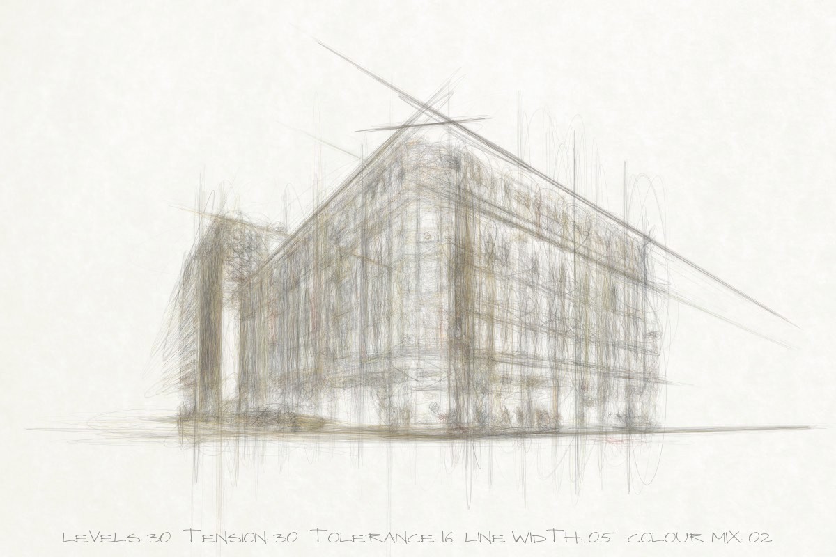
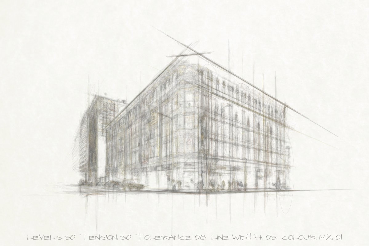
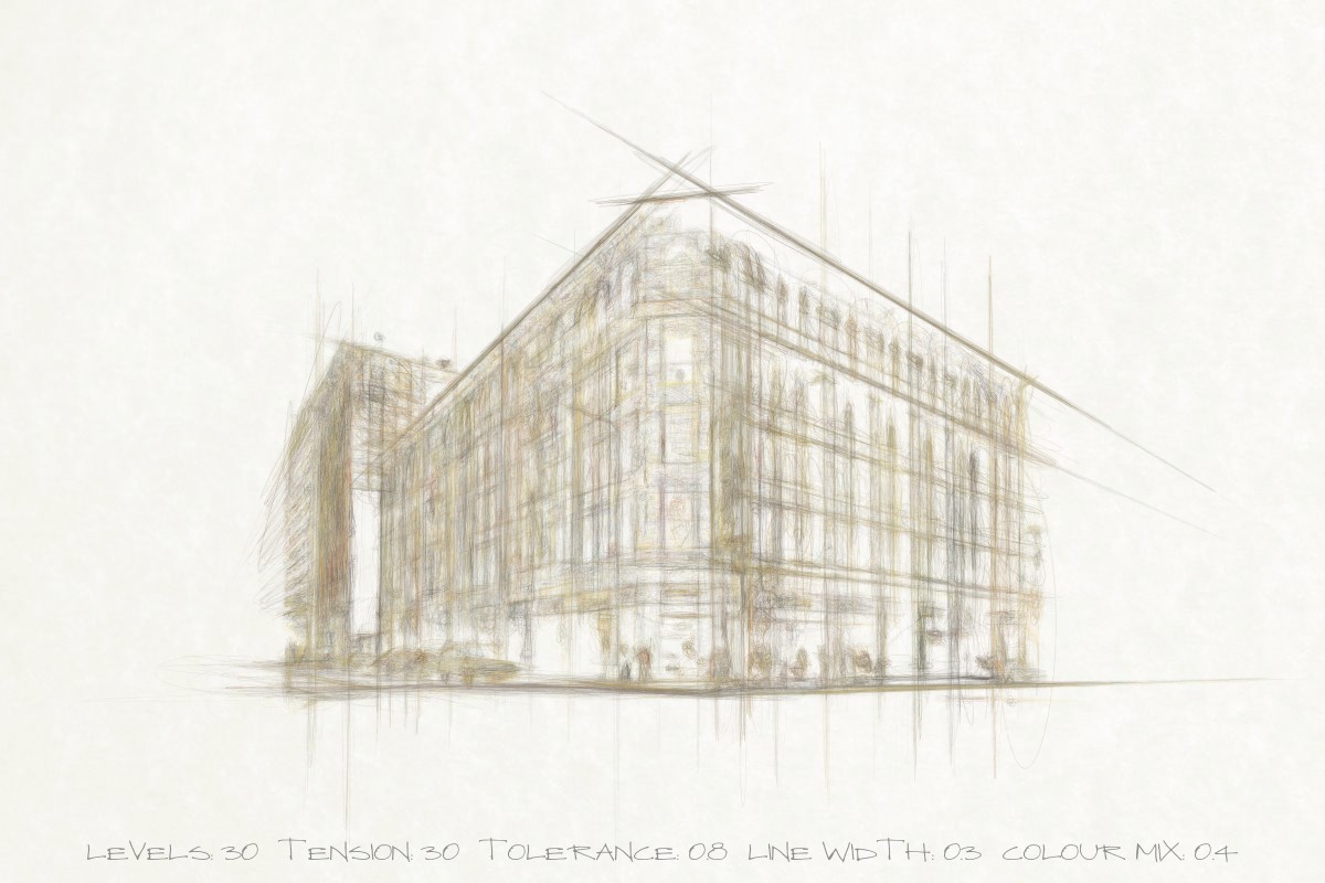
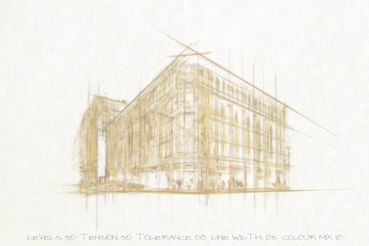
To illustrate consider the effect of various parameters on the rendering of the Bradbury Building.
Spline tension controls the degree and shape of the inter-vertex looping. As the tension parameter is increased, non-circular isolines become increasingly elongated, creating a 'construction line' effect (click below to see full size images) :


Simplification tolerance controls the fidelity of the structural features of the image. The greater the simplification, the more abstract the rendering appears:


Number of iso-levels determines how many different grey levels in the base image are identified. As the number of levels increases, so further structural detail appears in the sketchy rendering:


In addition to those parameters that influence the geometry of stroked lines, their colour may be varied. Here the balance between grey and coloured 'pencils' is varied:


This approach provides five dimensions of visual style that may be varied in any combination. Together they can be combined to give designs with contrasting hand-drawn or painted appearance:


This particular visual style appears to mimic a sketchy architectural style well, with the elongated 'construction lines' emphasising the two-point perspective projection and the angular features of the building. But it may be applied to the softer lines of human form too:


Would these images pass a visual Turing test? Almost certainly not with even modest scrutiny. Could the approach be used with serious information visualization? Early studies in sketchy infovis have suggested it may influence perceptions of data uncertainty and authority, but evidence is far from conclusive.
Expanding the palette of design approaches that evoke something of an artist's expression offers the opportunity to frame the way we communicate visually in new ways. The interplay between the mechanised production of the visual and personal, human expression has intrigued artists from Roy Lichtenstein to Sergio Albaic. Blending the distinction between the manufactured and created in information visualization should intrigue us too.