THOUGHTS ON DESIGN GUIDELINES >>
The Barcelona workshop with Exipple in Jan 2015 got us thinking about design guidelines and influences for our visualization project.
These are all very provisional, but some possibilities and influences follow ...
1. keep your eyes on the data
Keep them off the controls and on the screen - we need our eyes to be where the action and the data are.
Yvonne Jansen's Tangible Remote Controllers are a great example that are shown to work in Yvonne's research and may inspire ideas.
2. start with "what's new?"
Coming up with some kind of workflow mantra might be useful here. Looking at what's new, comparing it with what's known and situating incoming data with current knowledge and knowledge needs could work well.
3. move things to counter occlusion
Much of the giCentre work aims to minimise occlusion. We want to be able to see everything concurrently even if we have to move stuff around.
See BallotMaps for an example or any of the Spatially Ordered Treemaps work. Or load BikeGrid and play with the G and M keys for Grid and Map layouts.
Love the London Squared Map which does something similar to our BallotMaps with the London boroughs.
4. controls are only there when you need them
Bertifier from INRIA does this really nicely - it's worth spending some time on this.
The Perin et al (2014) InfoVis paper and videos and images are all available at the Bertifier page.
5. need is* determined by location (cursor | eye | data)
* could be
In a way Bertifier does this, revealing different controls in different paces, but we may be able to use this kind of approach in more specialized and sophisticated ways.
6. moving containers (view and token) to different places has effect.
Where you put things gives them properties ... and relates them together. When you move them - this effects meaning. BUT - see [3] above!
7. always have a description* of configuration in natural language.
* this could be a control
It was tough to get an interpretable title for all of the PlaceSurvey views - even those generated through filtering and conditioning. But we just about managed this - have a go, and look at the paper - Slingsby et al. (2014).
I was really impressed by GLO-STIX at InfoVis (Stolper et al., 2014) and this might be able to use description as control. Have a look at the short video for some nice ideas that might influence our approach.
EXCITING IDEAS THAT MAY BE INFLUENTIAL >>
I showed a few examples of nice designs and interactions that I think folks should consider for the initial designs ...
PivotPaths - Doerk et al (2012) - watch the video and try the demo. A super smooth way of 'strolling' through information spaces with information reconfiguring to changing needs.
OnSet - Sadana et al (2014) - Lovely interactions and encodings to explore the relationships between sets. Try it: the software is online on the OnSet pages along with a video.
SketchStory - Lee et al (2013) - Microsoft Research present a fluid way of generating stories with sketches.
UpSet - Lex et al. (2014) - An elegant way of showing set relationships and developing set queries. The video is excellent.
LiquiData - FH Potsdam - multitouch mapping with handheld devices as tangible controls and data repositories. Sophisticated and elegant interactions from Till Nagel's group. Try the video on the LiquiData page.
DOSA - van den Elsen and van Wijk (2014) - sophisticated interaction, selection and summary representation of selected sets in their Detail to Overview via Selections and Aggregations software for multivariate network exploration.
Venice Unfolding - Nagel et al. (2010) - Till Nagel's polyhedral object and unfolding mapping libraries result in an interesting tangible artefact acting as a control to spatial information. See the video and other information on the Venice Unfolding page.
DIVA - Walker et al. (2013) - A City / Middlesex collaboration in which we produce rapidly re-configuring views to explore geo-referenced document collections. The video is useful.
Response Glyphs - Kachkaev et al (2013) - More giCentre work, this time to show large numbers of reviews of documents by a large number of reviewers. Collections of reviews are aggregated by document and reviewer for comparison in a highly interactive, linked, reconfigurable interface. The video explains all of this nicely.
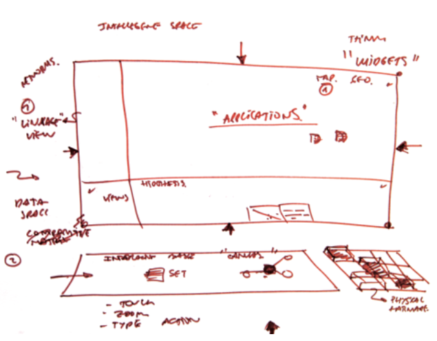
LINKöPING GUIDELINE DEMO HACK >>
1 - 3 - 25
>> Visual Encoding
- Position, size, and colour variations always have meaning in every view - e.g. Munzner (2014)
- Move things to counter occlusion - e.g. BikeGrid (Wood et al, 2010); LondonSquaredMap (AfterTheFlood, 2014)
>> Control
- The data is the interface - e.g. PivotPaths (Doerk et al, 2012); PlaceSurvey (Slingsby et al, 2014); SketchStory (Lee et al, 2013)
- Controls appear only when you need them and in context - e.g. Bertifier (Perin et al, 2014)
- Need is determined by location (cursor | eye | data)
- Always have a description of configuration in natural language - e.g. PlaceSurvey (Slingsby et al, 2014); Glo-STIX (Stolper et al, 2014)
- Physical objects and data may interact in interesting and useful ways - e.g. VeniceUnfolding (Nagel et al., 2010)
>> Cross-View Interaction
- Moving containers (view and token) to different places has effect - e.g. LiquiData (Nagel et al., 2011)
- Data can be selected and transferred from one widget into another - e.g. OnSet (Sadana et al, 2014).
>> Process
- Start with "what's new"? - e.g. PivotPaths (Doerk et al, 2012)
- Keep your eyes on the data - e.g. Tangible Remote Controllers (Jansen et al., 2012)
- Workflows can be saved as a template in order to be applied to other data - e.g. DIVA (Walker et al., 2013)
>> Things We Don't Say ...
... deliberately in some cases ...
- How to Achieve Consistency
- Interactions & Conflicts
- Anything Specific
- Various Other Stuff ...