
The giCentre at City University London continues its research in developing innovative techniques for the visual presentation and analysis of spatial and other data. We do so in a broad range of domains, including movement ecology, human terrain analysis, energy, social surveys, musicology, geography, intelligence analysis and transportation. We have received Best Paper awards at the IEEE Visual Analytics Science and Technology, IEEE Pacific Visualization and EuroVIS conferences for this work.
New methods include our sketchy renderer for hand-drawn maps and graphics developed with the Aviz lab at INRIA Saclay and implemented in the 'handy' library (Wood et al. 2014), our work on curved schematization (van Goethem et al. 2014a) and stenomaps - in which areas are mapped with lines - (van Goethem et al. 2014b) with TU Eindhoven.
We have recently developed two approaches for representing origin-destination (OD) flows - a persistent challenge in many domains. Where flows are diverse and spatially concentrated, drawing lines between OD pairs leads to a cluttered graphical display with any overall structure often made unintelligible. Our first approach, shown in Fig.1a, helps to overcome the problem of visual clutter and involves manipulation of the visual variables used to represent flows. Flow lines are drawn with Bezier curves with a weighting factor to emphasise flow magnitude – the relative thickness, transparency and colour of each flow line varies according to the number of flows that are presented by that OD pair. To prevent less frequent flows from occluding more frequent ones, the curves are drawn in ascending order from least to most frequent. This approach necessarily privileges analysis of the most common flows and visual salience bias is not entirely avoided, as longer flows appear more prominent than do shorter ones. OD maps (Wood et al. 2010) provide an alternative approach (Fig. 2b). Here an OD matrix is created where cells are arranged so as to preserve geographic context. The larger reference cells signify the origin location at which flows start; each larger cell contains a further set of spatially arranged grid cells, and these are used to represent destination locations. The destination cells are then coloured according to OD frequency. Although the arrangement of cells attempts to preserve spatial relations between locations, the cost of this technique is that some spatial precision is lost. The substantial benefit is that equal graphic space is given to all potential OD pair combinations. These techniques have been variously applied in migration studies (Slingsby et al. 2013, Slingsby et al. 2014) and social network analysis (Slingsby et al. 2013), but perhaps most notably, through a long-term collaboration with planners and policy makers at Transport for London (Wood et al. 2014, Beecham & Wood 2014a, Beecham & Wood 2014b, Beecham et al. 2014). Maps of activity through the London Cycle Hire scheme used in this collaboration are shown in Fig. 1.
Dr. Aidan Slingsby and Dr. Cagatay Turkay have joined the giCentre as full time lecturers in the Dept. of Computer Science at City and Drs. Gennady and Natalia Andrienko join us on a part-time basis.
We make giCentre research available online – with papers, code and videos available at http://gicentre.net
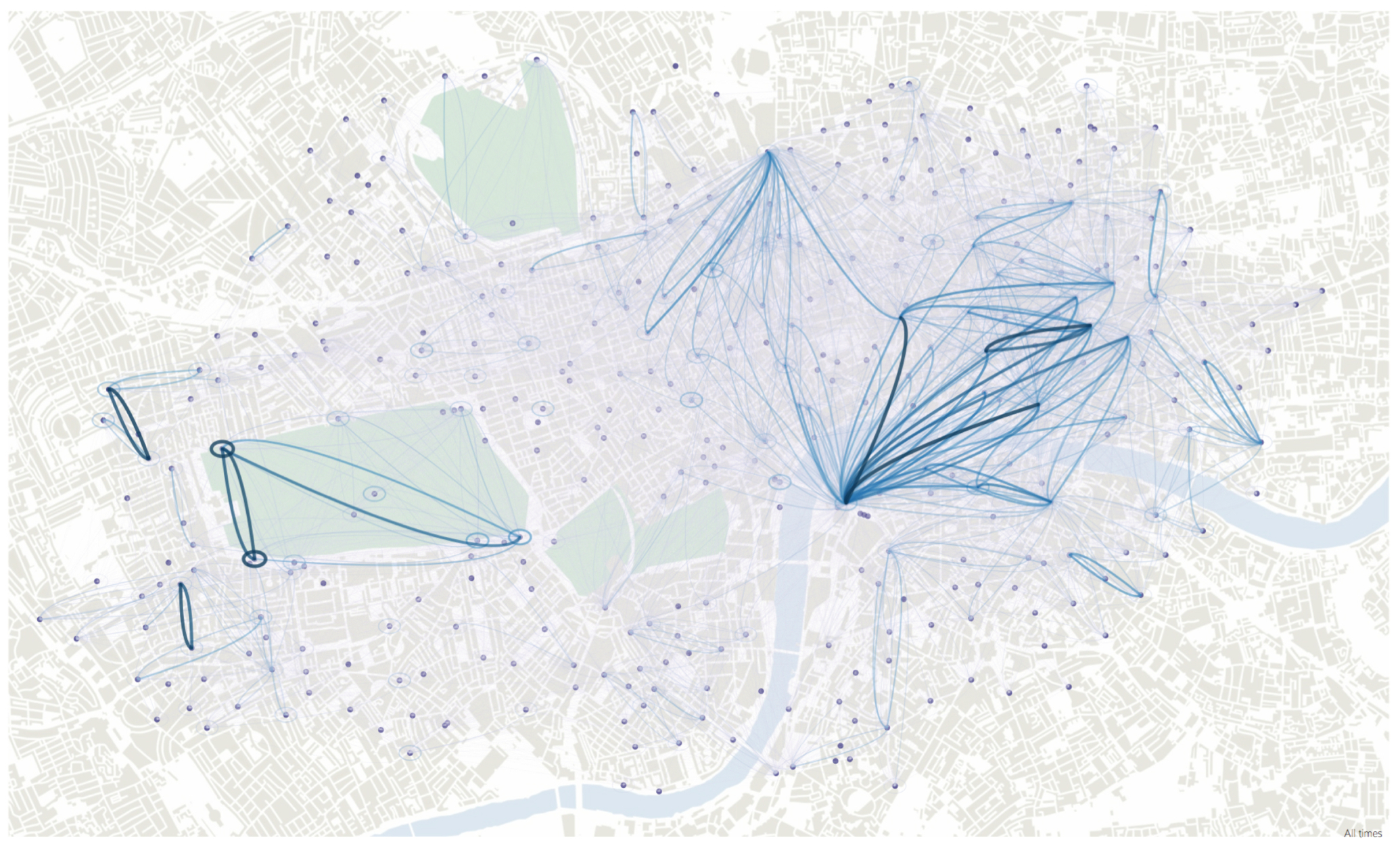
Fig 1a. Bezier curve flow map showing journeys made between docking stations of the London Cycle Hire Scheme between 21st September – 20th October 2011. The overall structure of scheme usage is emphasised. Figure previously appeared in Wood et al. (2011).

Fig 1b. OD Map map showing journeys made between docking stations of the London Cycle Hire Scheme between 21st September – 20th October 2011. Local variations can be more easily identified. Notice the large geographic spread of destinations (row 7, column 4) that can be distinguished from the localised travel from neighbouring docking stations (row 7, column 5). Figure previously appeared in Wood et al. (2011).
REFERENCES
Beecham, R. & Wood, J. (2014a), ‘Characterising group-cycling journeys using interactive graphics’, Transportation Research Part C: Emerging Technologies, 47(October), 194–206.
Beecham, R. & Wood, J. (2014b), ‘Exploring gendered cycling behaviours within a large-scale behavioural data-set’, Transportation Planning and Technology 37(1), pp. 83–97.
Beecham, R., Wood, J. & Bowerman, A. (2014), ‘Studying commuting behaviours using collaborative visual analytics’, Computers, Environment and Urban Systems 47 (September), pp. 5–15.
Slingsby, A., Beecham, R. & Wood, J. (2013). Visual analysis of social networks in space and time using smartphone logs. Pervasive and Mobile Computing, 9(6), pp. 848-864.
Slingsby, A., Kelly, M. & Dykes, J. (2014). Featured graphic. OD maps for showing changes in Irish female migration between 1851 and 1911. Environment and Planning A, 46(12), pp. 2795-2797.
Kelly, M., Slingsby, A., Dykes, J. & Wood, J. (2013). Historical Internal Migration in Ireland. Paper presented at the GIS Research UK (GISRUK), Apr 2013, Liverpool, UK.
van Goethem, A.,Meulemans, W., Speckmann, B. & Wood, J. (2014) Exploring curved schematization of territorial outlines, Proceedings, Pacific Visualization Symposium.
van Goethem, A.,Reimer, A., Speckmann, B. & Wood, J. (2014) Stenomaps: Shorthand for shapes. IEEE Transactions on Visualization and Computer Graphics 20(12), pp. 2053-2062.
Wood, J., Dykes, J. & Slingsby, A. (2010). Visualisation of Origins, Destinations and Flows with OD Maps. Cartographic Journal, The, 47(2), pp. 117-129.
Wood, J., Slingsby, A. & Dykes, J. (2011). Visualizing the dynamics of London's bicycle hire scheme. Cartographica, 46(4), pp. 239-251.
Wood, J., Beecham, R. & Dykes, J. (2014). Moving beyond sequential design: Reflections on a rich multi-channel approach to data visualization. IEEE Transactions on Visualization and Computer Graphics, 20(12), pp. 2171-2180
Wood, J., Isenberg, P., Isenberg, T., Dykes, J., Boukhelifa, N. & Slingsby, A. (2012). Sketchy rendering for information visualization. IEEE Transactions on Visualization and Computer Graphics, 18(12), pp. 2749-2758.