Alt.VIS - Illegible Semantics

Jason’s work with colleagues in Norway, Germany and the US was presented at the IEEE VIS fringe event alt.vis - “a forum for controversial, risk-taking, and boundary pushing research”.

The ‘Illegible Semantics’ paper looks at the relationships between the readability of text and its decoration with styling and flourishes that reduce readability but convey important information.

This exploration is focussed on the logos of heavy metal bands. It is driven computationally from a large database of logos and humanistically with reference to Gerrit Rijken, a logo designer whose practice is captured in the model that is produced.  

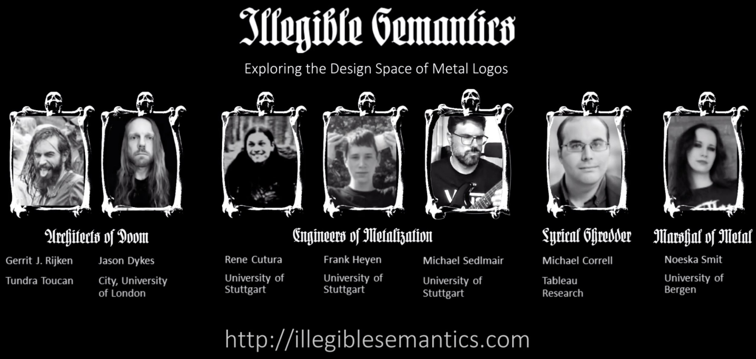
The paper attempts some humour, but is also serious about the need to take ‘alt’ perspectives and experiment with design practice and guidelines to inform innovative, useful and inspiring visualization.

It was delivered Gerrit - aka logo designer TundraToucan. The video presentation is online and was well received at the conference.

The MetalVis tool and associated materials are also online.

RAMPVIS for COVID Modelling & Visualization

We’re collaborating with epidemiologists and visualization researchers across the UK to develop approaches that make Visual Analytics an integral part of the technological infrastructure for combating COVID-19.

Our EPSRC funded COVID 19 Rapid Response project is coordinated by the University of Oxford and builds on some of the knowledge acquired and technology developed in the RAMP volunteering effort of the summer of 2020. We are using interactive visualization to help modellers understand model inputs, parameters, outputs and their spatial signatures.

Aidan Slingsby’s Gridded GlyphMaps are an excellent example of the way in which we are using flexible, fluid, interactive graphics to explore the needs of the modellers and the nature of their data.

Alexander Lex, University of Utah

Seminar - Alexander Lex, University of Utah

Literate Visualization:

Making Visual Analysis Sessions Reproducible and Reusable

Tues 17th November, 16:00 - 17:00, Zoom (City credentials)

Abstract

Interactive visualization is an important part of the data science process. It enables analysts to directly interact with the data, exploring it with minimal effort. Unlike code, however, an interactive visualization session is ephemeral and can't be easily shared, revisited, or reused. Computational notebooks, such as Jupyter Notebooks, R Markdown, or Observable are a perfect match for many data science applications. They are also the most popular embodiment of Knuth's "Literate Programming", where the logic of a program is explained in natural language, figures, and equations.

In this talk, Alex will sketch approaches to "Literate Visualization". He will show how we can leverage provenance data of an analysis session to create well-documented and annotated visualization stories that enable reproducibility and sharing. He will also introduce work on semi-automatically inferring mid-level analysis goals, which allows us to understand the analysis process at a higher level. Understanding analysis goals enables interactions to be sped up and visual analysis processes to be re-used.

Bio - Alex Lex

Alexader Lex is an Associate Professor of Computer Science at the Scientific Computing and Imaging Institute and the School of Computing at the University of Utah. Together with Miriah Meyer, he runs the Visualization Design Lab, which is developing visualization methods and systems to help solve today’s scientific problems.

Before joining the University of Utah, Alex was a lecturer and post-doctoral visualization researcher at Harvard University. He received his PhD, master’s, and undergraduate degrees from Graz University of Technology. In 2011 he was a visiting researcher at Harvard Medical School.

Alex has received an NSF CAREER award and multiple best paper awards or honorable mentions at IEEE VIS, ACM CHI, and other conferences. He also received a best dissertation award from his alma mater and co-founded Datavisyn, a startup company developing visual analytics solutions for the pharmaceutical industry.

Coronavirus Visualization

Coronavirus infection rates and case numbers are a growing concern in England. So analysing change-over-time in growth rates, as well as both absolute (total number) and relative cases counts (as a proportion of population size) is particularly important.

Doing this analysis for multiple areas at the same time (e.g. for Local Authorities in England) is a considerable challenge, but well-designed visualizations have a role to play and can expose some important patterns when we look at rates and numbers across the country.


Roger Beecham and Jason Dykes discuss ways in which this might be achieved in their Coronavirus Visualization twitter thread.

DisInfoVis - Articles, Videos, Poster

MSc Data Science graduate Alexa Pavliuc has been working in DisInfoVis - exploring the design and use of temporal networks for visualizing disinformation operations.

Alexa's work has been published through a EuroVIS 2020 poster and two Medium articles. The first is on her MSc Research - DisInfoVis: How to Understand Networks of Disinformation Through Visualization.

The second is based on additional work undertaken with the Mozilla Foundation and visualizes six Twitter-based disinformation operations - Watch six decade-long disinformation operations unfold in six minutes.

You can find more details on Alexa’s DisInfoVis repository.

Thanks to the Data Science Institute at City for awarding the stipend through which Alexa was able to complete much of the work. And best wishes to Alexa as she begins a DPhil in Social Data Science at the University of Oxford, where she will continue her studies of networks of disinformation.

Criteria for Rigor in Visualization Design Study

Jason Dykes and Miriah Meyer of the Visualization Design Lab, University of Utah, presented their 'rigor' paper at IEEE VIS in Vancouver. The paper intends to move visualization design researchers away from the kinds of system related findings and process orientated validation approach that are typical of design studies and towards ways of developing subjective knowledge constructs from applied visualization design contexts.

 
vis19-v4-deepDive-NN.jpeg
 

The paper frames visualization design study through an interpretivist perspective and aims to give design study researchers criteria that support subjective, reflexive, constructive activity. The paper also taps in to the 'design as research' and 'artefact as knowledge' strands of design (research) to frame the kinds of creative design and thinking that we do in visualization. It intends to give visualization researchers who design in applied contexts confidence in developing and presenting knowledge constructs relating to their experiences and observations of people using visualization to explore data.

Check out the 10-page IEEE Transactions in Visualization and Computer Graphics paper, or watch the 12 minute IEEE VIS presentation to find out how design study research may benefit from explicitly considering six criteria: INFORMED; ABUNDANT; REFLEXIVE; PLAUSIBLE; RESONANT; TRANSPARENT