

Jo Wood
Do you remember what you were doing as the clocks struck midnight on New Year's Eve at the start of 2015? Cyclist Steve Abraham set off on his bicycle in the dark to go for a bike ride. 19 hours later he got off his bike having ridden 222 miles along the roads of southern England in the depths of a British winter. That's a long way to drive a car in a day, let alone ride a bike. In fact, by 4am he had ridden further than the average adult in England rides in a whole year (49 miles). But Steve didn't stop there. He got back on his bike the following day, and the day after that. In fact, he set off intending to ride every day of 2015 to break the world record for the furthest cycled in a year. That's a staggering 75,065 miles – a distance record set in 1939 by fellow British cyclist Tommy Godwin.
There's a reason this world record hasn't been beaten in over 75 years. It really is a very long way. It requires a daily average in excess of 205 miles. Miss a single day and that distance needs to be made up – 410 miles the following day, or perhaps more sensibly spread out over the following weeks. Miss a week due to cold or flu? That's a 1,440 mile deficit to make up. After Tommy Godwin achieved his record, he had to spend several months learning how to walk again; 15-18 hours a day riding a bike for a year takes its toll on a body.
In 1939 fans of Tommy and two rival challengers for the record could follow their progress weekly by purchasing a copy of Cycling magazine in which their current cumulative distances were published.

Weekly mileage update from Cycling magazine, 1939.
In 2015, as well as Steve, Tommy's old record has three other challengers. Texas-based William Pruett and Arkansas-based Kurt Searvogel set off to attempt the record on the 4th and 10th January respectively. Miles Smith from Melbourne, Australia began his world record attempt on April 11th. This time though Steve, William, Kurt and Miles will be monitored more closely than the riders of the 1930s. Each equipped with a GPS receiver, a SPOT satellite broadcast tracker and a heart monitor, they can be tracked in real time with daily updates on Strava showing their power output, daily trajectory and heart rate minute by minute.
That's a lot of data. Or will be once each has ridden for a year. Strava provides plenty of good interactive visualization of the data including maps of their trajectories, charts of distance, elevation, power, temperature and heart rate over distance and time.
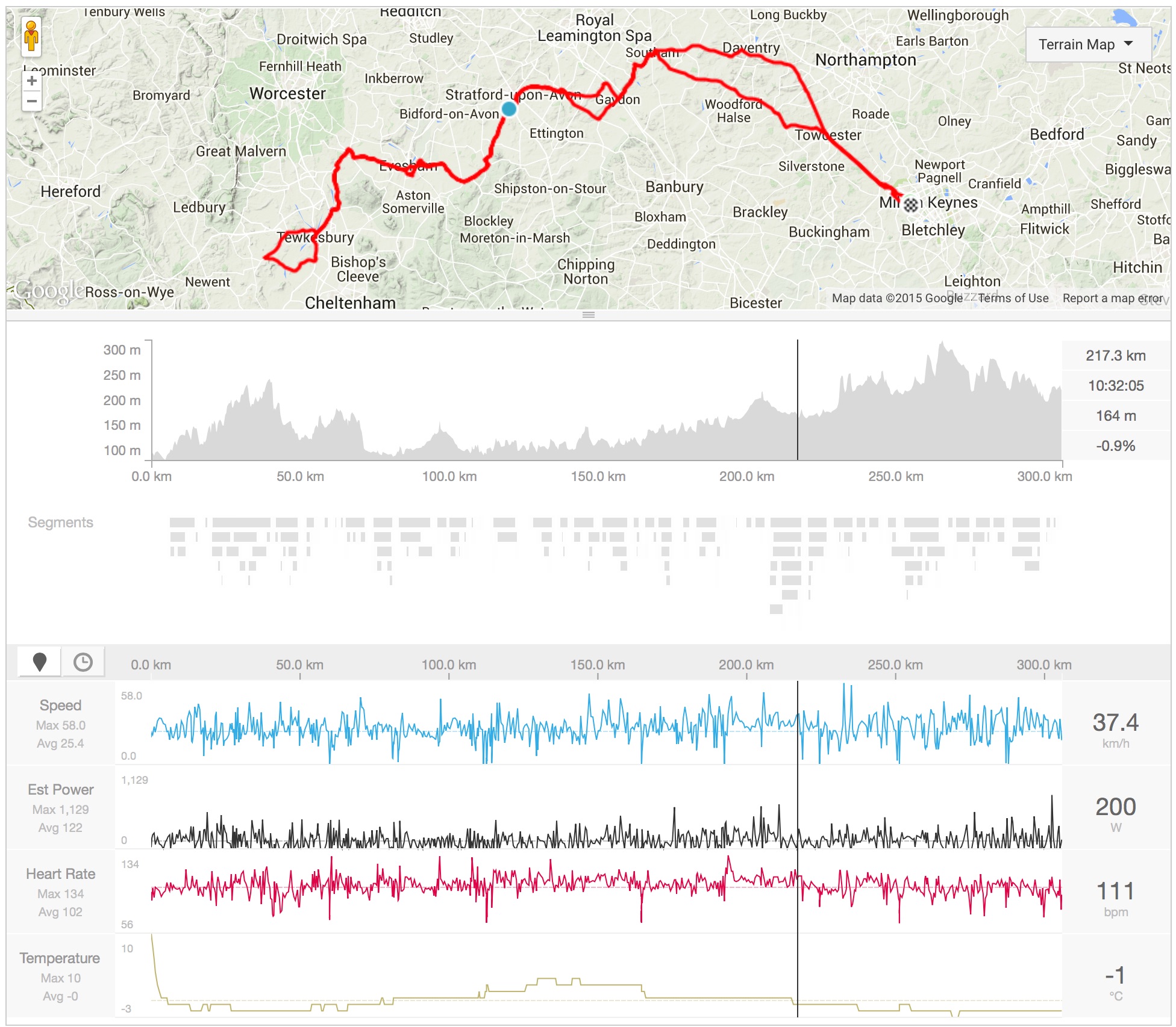
Sträva visualization of a single day's riding showing elevation, speed, power, heart rate and temperature
What other possibilities exist for visualization of the progress of the challengers to this endurance world record? Conventionally, geospatial data of this type are shown in map form (as, for example, provided by Strava). This works well for a single day's ride, but for longer periods benefits from being converted into some form of route frequency or density mapping (a so-called 'heatmap'):

Steve Abraham's 'heatmap' of routes as of 29th March, 2015.
But the map view tells us little about how well any of the contenders are doing or how they have covered the ground. An animated view showing routes over time provides some of that detail and can present an engaging picture of their endeavours:
Animation of Steve Abraham's (red) and Kurt Searvogel's (blue) progress from January-March 2015. both maps to the same scale (600km along each side)
But neither of these conventional geospatial views really tell us whether the riders are on schedule to beat the world record or how they are faring relative to one another. Unlike a shorter race, here many of the roads are ridden multiple times so there is less value in mapping the spatial footprint of the riders.
CUSUM Charts
For a more effective visualization design it is instructive to look at how the progress of the contenders in 1939 were visualized at the time. Below is a clipping from a 1940 edition of the now defunct magazine The Cyclist showing Tommy Godwin's progress as a time vs cumulative distance chart along with his rivals Bernard Bennett and previous record holder Ossie Nicholson. Superimposed on the chart are Godwin's weekly mileage totals through the year.

Rider progress chart from The Cyclist magazine, 1940.
Putting aside some of the style choices made (e.g. grid lines dominating over the actual data lines; a slightly confusing superimposition of scales), this rather simple design is effective in visualizing the race as it unfolded over the year. It also affords comparison with Ossie Nicholson's previous record pace by showing his average annual speed as a straight dashed line. This acts both as a reference gradient (shallower than that line and a rider is accumulating distance more slowly than the record pace) and reference distance (to beat the record, a rider's line must end the year above the line).
Can this design be improved? One of the difficulties in reading the chart is that deviations away from Nicholson's record line occupy a relatively small part of the chart space. For the first half of the year in particular, the close overlapping lines are difficult to distinguish, especially when constrained with relatively low-resolution black and white printing technologies.
One simple transformation to make comparison easier is to measure the cumulative distance of each rider not in absolute terms, but relative to the pace set by the previous record holder. Effectively rotating the chart so the average speed line of Nicholson is projected horizontally. Engineers call this a CUSUM (cumulative sum) chart and it is particularly effective in allowing gradual trends away from a mean or expected behaviour to be emphasised.
Here is such a chart for the first five weeks of 2015 relative to the pace set by Tommy Godwin in 1939. Searvogel in blue, Abraham in red, Pruett in green and Godwin's first five weeks in grey.

CUSUM chart showing four riders’ progress. The horizontal axis represents time, the vertical axis distance ahead or behind an imaginary cyclist riding at exactly the world record speed (205.7 miles per day or 8.6 mph every second of the year)
The regular fluctuations show Searvogel and Abraham gaining on Godwin's world record pace during the day while they are riding and then falling back at night while they sleep. This is in contrast to Pruett's daily distances that are generally not far enough to make a dent in his downward trend relative to Godwin's pace. Godwin himself started the year in 1939 way below his own eventual average annual pace so also trends downward for the first few months of the year. The steeper upward lines of Searvogel compared to Abraham show he rides for shorter periods of time but at a faster pace. Overall the upward trend during this period shows Searvogel accumulating greater distances than Abraham.
One of the disadvantages of the CUSUM projection compared with a more standard time-cumulative distance chart is that absolute distance is no longer parallel to either axis. It therefore requires additional grid lines to indicate distance and slightly more cognitive effort to compare distances:

CUSUM chart for Kurt Searvogel (blue) and Steve Abraham (red) with distance lines superimposed.
The angle of these distance lines is dependent on the vertical (distance away from Godwin's world record pace) and horizontal (time) scaling of the chart. But once this 'visual grammar' has been learned (e.g. that nothing can ever slope downward more steeply than these distance lines; that a horizontal trajectory is equivalent to 205.7 miles per day or 8.6 miles per hour; that moving upward on the chart is “good”), this can provide a discriminating visually sensitive form of graphical representation for slowly evolving patterns.
Storytelling
One of the characteristics of the CUSUM projection is that it emphasises small changes away from average behaviour the moment it occurs. Useful for real-time monitoring, it is also helpful when telling a story of the progress of the riders day by day as ‘events’ that shape their progress can have immediate visual expression. For example, on April 5th, Kurt Searvogel had a comparatively short day of 112 miles instead of his more usual 200. The result visually was to interrupt the upward trend evident from the previous few weeks. On the 16th April, he developed a stomach bug from contaminated water and his subsequent recovery involving two days with little riding. The effect on the CUSUM line was dramatic, undoing in two days, all the progress towards the world record pace (black horizontal line) made over the previous four months.

Kurt Searvogel's progress and setback after a poisoning from contaminated water
On the 29th March, 2015, Steve Abraham was involved in a collision with a reported drunk motorcyclist, breaking two bones in Steve’s ankle. His hospitalisation, involving an operation to pin his bones and placing his leg in a plaster cast, stopped him from riding for several weeks. The effect on his CUSUM line was dramatic.
If a more standard cumulative distance or average daily distance chart had been plotted, these incidents would be barely detectable even though important to the riders and the narrative of their progress. It reflects the rule popularised by world record holder Graeme Obree – time trials are won not by going fast but by not going slow.
The CUSUM projection, while emphasising temporary setbacks, also makes a ‘goal’ explicit (in this case, to accumulate more than 75,065 miles in a year). The black horizontal line represents not only the goal at the end of the year, but the pace required to achieve it throughout the year. Overcoming obstacles to achieve a goal against all the odds is a primary ingredient to many stories. The chart makes that goal visually salient with a simple encoding of progress towards the goal (upwards) and setbacks away from the goal (downwards). Onto this space can be superimposed intermediate goals, such as the earlier record distances achieved by other riders in the 1930s. In story telling terms, reaching these intermediate goals can be thought of as “levelling up” on the way to reaching their ultimate goal.

Progress of the riders as of 2nd May 2015 with previous annual record distances shown as the steeply sloping brown zones towards the right, The current world record, held by Tommy Godwin in grey, intersects the horizontal axis at the right of the chart.
By mapping out that space in a consistent manner, a sense of anticipation can be built as the progress lines of each rider incrementally accumulates day by day. Changes in the riders' relative fortunes are sufficiently visible in the chart to add daily interest. To the right of each rider’s line is the task ahead of them, which can be further emphasised by plotting their scheduled daily ride plan. This helps to see how far each rider is ahead or behind their anticipated progress building a "will he, won't he?" tension into the visualization.

Progress of the riders as of 2nd May 2015 with previous annual record distances and riders' scheduled plans superimposed.
As of May 2nd, it is not clear whether or not any of the riders will break Tommy's 1939 world record. Kurt has made the best progress, but the CUSUM chart shows that even comparatively minor setbacks can pull riders back from the pace needed to hit that 75,065 mile target. Following Steve's hospitalisation he has a major challenge to get anywhere near his original goal. In Miles's case, having ridden only for three weeks, it is too early to tell how he will do, although he will have to start increasing his daily distances in order to keep near the world record pace.
Telling a story with data visualization need not be limited to 'infographics' or strongly editorialised content. Sometimes a data projection that highlights what we find most intriguing, what captivates us and allows us to identify with the subject is all it takes.
You can find the daily updated CUSUM chart at gicentre.org/oytt
Thanks to Dave Barter for access to archive material from Tommy Godwin's diaries, Cycling, 1939 and The Cyclist 1940 and to the members of YACF for suggestions for improving the CUSUM charts.